 |
| Hue + 5, Saturation -25 |
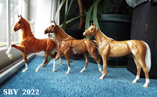
There are many things good about Chadwick the Palomino Emerson. He is beautiful. I'm semi-conga-ing Emersons -- I now have 5. I love a glossy and I don't care about little goobers in his finish or paintjob, not the way I see others caring. (If they're on white -- he had a couple -- a few knifestrokes takes care of them!) I have a soft spot for palominos, and his eyes appeal. The longer I keep this horse, the more he grows on me. Yet,... sigh,... I thought he'd be a redgold, the orange-toned palominos I love best. What his sale picture showed. And he wasn't,... in person he's a peanutbutter, of all hues my least favorite palomino.
If this post is confusing it's because I find unexpected yet unsustainable disappointment confusing. Perhaps I might find out that (in some impossible way) not all Chadwicks turned out peanutbutter palomino, and that some are the glorious old redgold which I know Breyer is capable of, -- AND I might find someone who might trade their redgold for my peanutbutter, --- but until then, ... I'm keeping him, ...he grows on one, ...
 |
| As much sunlight as is possible on a grey day |
When I peered through the lens at this new horse, he looked so close to what I expected. (Stephen Spielberg's sentence in his TIME mag article: "I only believed it when I saw it on film.") Even when the shot was downloaded and saved, it still came out as above: There was very little to complain about. The horse appeared golden orange. But that wasn't what my eyes were seeing.
Chadwick has reminded me that I and my camera do not see eye to eye. Decades of playing with PhotoShop has taught me the power of Hue and Saturation. Below is an unprocessed shot.
And here, processed, is what's really going on:
Raise the Hue by about 5 and reduce the Saturation by about 25. The Saddlebred does not lose his bright redgold, that is, his orange tones. But Carrick and Chadwick are in the peanut butter jar. (Unfortunately my camera also exaggerates Chadwick's muzzle, which is fisheye behaviour on its part. This phenom also stretched out the ASB's foreleg in the first 2 shots.) I had fallen in love with, and bought, what I thought was a Saturated red-orange horse, and he just wasn't.
Thinking of Lafayette and dashed expectations: that was another horse I learned to love. I suspect the lesson about not buying horses sight unseen is one I'm doomed to repeat.
True to the traditions of King's Herd, Chadwick is wearing Duke's Hackamore as his first piece of tack. There's a piece you'll be hearing a lot more about in future... it's in the next book!


No comments:
Post a Comment