Friday, December 30, 2022

Grab Bag


What else am I going to title a post about four new enamel pins, a Trad scale harness bridle resto job, a new Stablemate and a near-record low temperature?  Oh yes and a couple of new Mink stickers!?  My year 2022's review has already taken place with the writing of my Christmas letter, and there was no overflow of photos from that, sorry.  I've been so busy preparing for a January canoeing trip (among other things) that what would normally be two blog posts, or more, seemed best condensed down to one.  Grab bag is just the best description.  The title came to me in advance of Breyer's latest offering advert, in case you're wondering.

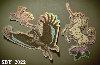
The four new Mink pins could well have been a separate post.  We'll start with a pair of fabulous Mink stickers which came with my new pins.  I still haven't gotten used to the freewheeling generosity of a Minkiewicz Studio pin order, and I thought the glitter factor of these particular stickers was spot-on perfect.

It is surely not a coincidence that both of these creatures have appeared (or will appear) as enamel pins.  Dakkaar on the left and Unicorn 2 on the right:  I already have the Unicorn pin (the image is flopped) and I know Dakkaar is in the pipeline.  His pin form sale date is still unknown -- he was first published about on June 13  -- but I'm willing to wait.  (The record wait time for a Mink pin is currently held by the FlutterPonies at a year and 2 months.  Most appear within 2 months and some pins within 1 month.)  My personal theory is that it really is very hard to make a black enamel pin, and we are waiting for a certain standard of excellence.  But I don't know for sure.

Here is Ad Astra, a beautiful design of a starry mare.  I apologize for the shot being so out of focus.


Here is a horse I've taken to calling "Roman-style" because he just looks that way to me.  His official name is Holiday Runequine;  when he first showed up, Sarah called him 'stylish.'  I love his carousel-horse-like design and subtle red sparkle berries.  The gold metal and white enamel is so crisp and beautiful.  The photo does a poor job of showing the graduated hues of blue; trust me they're there.

I snagged the two Runedeer pins.  Here is Runedeer 2.  Mink is rightly proud of his splendid design.

I will complete this self-indulgent stretch of pin-worship with a very strong statement of love for the glitter background of -- Mishkazelle!!  Mishkazelle has a wonderful depth and gloss in her glitter; it is spectacular in person.


Here's my whole collection minus the unicorns (they have their own board).

 Let's take a look at how low the thermometer got during that national storm last week, right before Christmas.  The lowest I can remember seeing this house get was minus 4.  The sensor is off the back deck.


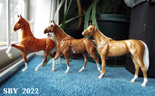
Moving on, I had a very good mail day this past Monday.  Two packages came in.  When I placed them together the unintentional result was strongly reminiscent of the old Winter Photo Challenge question:  Scale Issues!!

Thank you Anne for the lovely Kit.  I collect palomino SMs and this fellow was so sturdy-looking and interesting.  If I were into making harness for SMs he would be among the first ones I'd pick to drive!   (The temptation to name him Carson is irresistible.)

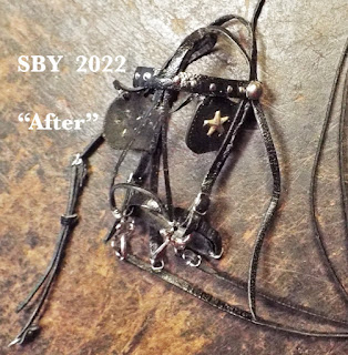
The harness bridle was returning to its natal shop for a simple bit swap.  I didn't take the time to look it up, other than to note it was built a long long time ago, probably in the 90s.  The customer took care of her tack, and that is so refreshing to come across -- thank you G.H.!!  Here is the bridle in its 'before' state:  Note the simple ring bit, the crown strap being too big for this mold, and the general darkness of the buckles.  They are galvanized steel, oxidized to a dark grey color.


Here it is after a Half Cheek bit was installed, the crown shortened by moving a blinker upwards, all buckles replaced with stainless steel, and the overcheck rewired with new 28ga.  All strap parts cleaned and oiled.  Incredibly, all this was done inside 48 hours.  I can scarcely believe it myself.  Don't you love the look in her eye!

I also lengthened the split in the overcheck, trying to accommodate that mane.  This was partially successful.  I have to hope that general adjustability will serve.


In Other News, I am planning to be on the road for most of January.  We shall see just how much work I get done on the next book and Malaguena's Bridle No. 2, which is where we're up to.  I am still working on getting Christmas letters out, ... deep sigh..., ...

Visit our recently updated website, www.timarustarii.com and enjoy catching up on three years' worth of pieces...unless you've been reading this blog all along, in which case you know already!  This coming spring I will have some resins to sell as well as braidwork pieces spun off from the book.  The year 2023 will be a close race between my love and devotion to braidwork and Breyer's focus on harness and driving.  Of course miniature harnessry has long been a great love of mine; I have made over 100 sets of model harness.  One of the best parts of the Guide is its harness chapters.  But I honestly don't know how I'll handle the next BreyerFest.  One possibility is with horse-drawn-vehicle displays in someone else's room.  Heaven knows I have plenty.

Thank You to every customer and friend, and 

Have a wonderful New Year!


Sunday, December 11, 2022

Four More Pins


This post will be about showing off 3 new pins in my collection and one older one I haven't covered before.  Only one is a Mink -- but you have to agree, she takes the cake!  Her spirit soars.  The more I look, the more I like this pin.

The first pin is a catch off eBay, which gave me camera adventures.  I use the word to refer to 'difficulties I'd rather not've had but which taught me something.'  This is the Very Important Persons Limited Edition of 1000 pin for 2021.  For the record I paid $36 for it.

The first shot is typical.  He's out of focus.  The lighting is bad.  Reflections are running amok.  I zoom in, use the closest macro the camera is capable of, and try lighting from the side with a flashlight.  I'm trying to show that those teeny spots actually have color in them.  The pin is only two inches long.  (I just measured it. Claims on eBay that it's 2.25" "in height" are completely wrong.  It's 1.25" high.)
Here at last you can see that most of the larger spots really do have color inside, and that they match the spectrum across the body.  But the smaller spots are solid black.

Super close, things get out of focus.  I am disappointed that there's no color in the eye.  What looks like an expanse of white with island spots rising out of it is a definitive effect for soft enamel pins, as opposed to hard.  To the touch, I swear, it feels smooth and hard all over.


Finally, a nice portrait.  Having this pin is yet another example of 'the only way I'll ever get to own this horse.'  Nonetheless I think NaMoPaiMo has something to say about this...

My next pin to show off is Jorannazazi from Minkiewicz Studios.  Here is where my camera makes her nicer than she is, and I liked her before!  I think I'll leave those reds as they are!  The surface is smooth.  This bay Pegasus is a hard enamel pin.

I find this pin just as astonishing as Mink's others.  The detail is amazing.  So what if it looks dull from a distance!  So what if her eyes are mere black lines...  There is so much power here.  (That is the Black Malik's rump to the right, Breyer's "Arabian.")  In all my browsing on other enamel pin sites and groups, only acrylic pins even approach these in level of detail; and there is still nothing like Jorannazazi.


A confession:  the belly color is not shaded or graduating as this photo shows, but all one color instead.  My flashlight gave her this modulation.  Typically the only way to achieve shading in a hard enamel pin is with screen printing.  Some of Mink's pins are screen printed, such as the Manchado Cave Pony and Baxter.

My last two pins to show off are a red Unicorn and a very intriguing Draft Pegasus.  The Unicorn is, I think, rather common; I've seen other versions on eBay.  I was attracted by the color (red again!) and the surface finish -- those gloss domes just feel so smooth.  The conformation wasn't too bad.  The Drafter had come in earlier, another eBay find, and I really know very little about him/it/her at all.

I do know how hard it was to photograph.  Let's examine those fabulous rainbow wings:

This is a little guy, just one inch long.  The moment I saw it I felt it belonged in my collection, since it hit every requirement and had a hint of mystery besides.  Why are the mane and tail different colors? 
Why, with the rest of the horse so well done, is that off foreleg so poorly formed?  Was there an accident, or are they all that way?  I've not yet seen another of this pin.

And why oh why couldn't I shoot the bright metallic gleams and glints of the red color?!  My eyes have no trouble seeing them!  They were definitely there...  The shot below gives another, and better, view of the red Unicorn.  I've seen other designs of red Unicorn pins out there, as well as some deer pins which are calling to me.

 In Other News...

As of the 11th of December (2 years, 9 months since pandemic began), my Christmas letters are written AND printed.  This is a minor record:  never so early before.  We are planning to be on the road (FL) nearly all of January.  I will be balancing work on the next book with Christmas and the inevitability of trip life.  If the message hasn't gotten across before: Thank you for reading, Thank you for being there, thank you for your patience!  I would be, my family of 2 would be, nowhere without you.

Merry Christmas and a Happy New Year!


Chadwick


Hue + 5, Saturation -25
 I could just as well have called this 'Chadwick vs the Incandescent Camera.'  Another equally good title might've been "Disappointing Palominos."  That's a much stronger title, and in the spirit of the season I'm not sure I want to use so powerful a word.  Yet this horse is really making me dither.  I'm suspended between like and dislike.  I drag myself back to liking him.

There are many things good about Chadwick the Palomino Emerson.  He is beautiful.  I'm semi-conga-ing Emersons  -- I now have 5.  I love a glossy and I don't care about little goobers in his finish or paintjob, not the way I see others caring.  (If they're on white -- he had a couple -- a few knifestrokes takes care of them!)  I have a soft spot for palominos, and  his eyes appeal.  The longer I keep this horse, the more he grows on me.  Yet,... sigh,...  I thought he'd be a redgold, the orange-toned palominos I love best.  What his sale picture showed.  And he wasn't,...  in person he's a peanutbutter, of all hues my least favorite palomino.

If this post is confusing it's because I find unexpected yet unsustainable disappointment confusing. Perhaps I might find out that (in some impossible way) not all Chadwicks turned out peanutbutter palomino, and that some are the glorious old redgold which I know Breyer is capable of, -- AND I might find someone who might trade their redgold for my peanutbutter, --- but until then, ... I'm keeping him, ...he grows on one, ...

As much sunlight as is possible on a grey day
I make myself like him.  He has solved a mystery.  When I first opened him I finally asked myself:  Why did I dislike peanutbutter palominos so much?  Answer:  It's the lack of red.  The best part of Chadwick, at that moment, was his hooves.  I was inside under fluorescents.  When I took him to the next room, the incandescents gave him a fair bit of orange back.  Sunlight, what little there was, made him peanut butter again.  Why had he looked so good online?  Why did other people's (FB) photos make him look so orangey-redgold? 

  When I peered through the lens at this new horse, he looked so close to what I expected.  (Stephen Spielberg's sentence in his TIME mag article:  "I only believed it when I saw it on film.")  Even when the shot was downloaded and saved, it still came out as above:  There was very little to complain about.  The horse appeared golden orange.  But that wasn't what my eyes were seeing.

Chadwick has reminded me that I and my camera do not see eye to eye.  Decades of playing with PhotoShop has taught me the power of Hue and Saturation.  Below is an unprocessed shot.

And here, processed, is what's really going on:

Raise the Hue by about 5 and reduce the Saturation by about 25.  The Saddlebred does not lose his bright redgold, that is, his orange tones.  But Carrick and Chadwick are in the peanut butter jar.  (Unfortunately my camera also exaggerates Chadwick's muzzle, which is fisheye behaviour on its part. This phenom also stretched out the ASB's foreleg in the first 2 shots.)  I had fallen in love with, and bought, what I thought was a Saturated red-orange horse, and he just wasn't.

Thinking of Lafayette and dashed expectations:  that was another horse I learned to love.  I suspect the lesson about not buying horses sight unseen is one I'm doomed to repeat.


True to the traditions of King's Herd, Chadwick is wearing Duke's Hackamore as his first piece of tack.  There's a piece you'll be hearing a lot more about in future... it's in the next book!