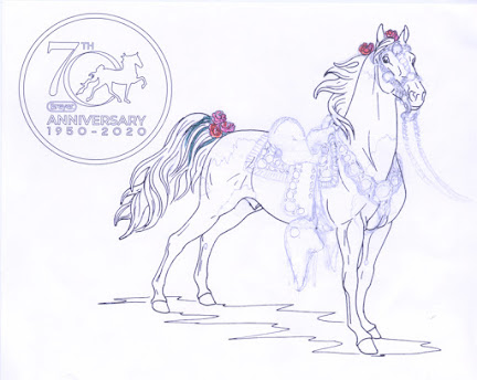
The flood of coloring contests during the pandemic finally reached critical mass for me. I had tried half-heartedly with one before, but with Morgen Kilbourn's Wycked Wynd I pulled out all the stops! Having watched Morgen sculpting Wycked from the beginning, I had latched onto the resin -- something about him, perhaps his purity, was irresistible -- and when he was done I decided I wanted one. The drawing was by Christine Jordan, and very inspiring it was. It is with inexplicable shyness that I publish here first; pandemic behaviour may manifest in strange ways.
[Ed note I just realized I've misspelt Wynd from the start. Sorry, & tried to fix on the 30th!]
From the beginning my artist's vision centered around three choices for this drawing, which would be done in colored pencil. I knew I wanted a golden bay with minimal white. I wanted the border to not distract. And most daring of all, I wanted to put tack on the horse -- not just drawing it on, but actually pasting on leather and silver and sinew --!!
Here is the one shot taken midway through, before the background and the reins were done.
I had once commissioned one of our great painters, Jenn Danza, to do a golden bay "so light you couldn't tell him from a buckskin." (She accomplished this with superb skill.) I now found out how hard that was!
I also found out how hard it was to do black with colored pencils. My black pencil was down to a nub from some previous adventure. I tried layering various purples, browns and dark blues; this had worked for NaMoPaiMo. But it didn't quite work here. In the end I resorted to black Edge Cote, an acrylic leather paint, to finalize the points.
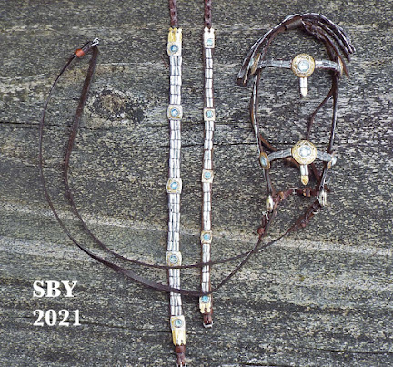
"Colored pencil, marker, nail polish, Gesso, Edge Cote. Bridle: leather, nylon sinew, silver tape [aluminum tape], ikandis [metal iron-ons], thread." And Elmer's. The nail polish was the shell hoof.
I felt oppressed by Wycked's border. No offense to Christine
intended! but I felt it was a lot to ask. It was distracting when my
focus would be entirely on the horse and his bridle. I was encouraged
by one early entry who made their border all one neutral color. I chose the light blue not only to compliment a golden bay, but to match the interweaves on the rein buttons. (!) It's not all solid light blue; the butterfly bodies have interweaves. :)
This is my one previous try to enter a coloring contest:
I guess you can tell what I'm interested in. :)I have been impressed that so many other entrants to Wycked Wynd's contest were bays of some sort,... and of them, many had an off hind sock. He just seems to look right in that color, though I'm prejudiced here. I swear I chose my markings entirely independently!
Early on, a friend responded positively to my approach. Surprising what a difference that makes! This shot is of my old drafting circles template framing his head. It shows the originally-designed reins.
Long ago in the dim beginnings of the world, (before I was married, in other words: about 1981), I made a quilt block for a quilt for my grandparents' 50th anniversary celebration. (My Mom is a quilter.) I had just purchased a Florentine Five-Gaiter. I made my block out of leather and tooled the horse on, then made a two-dimensional harness for it from lace and wire. I'm dreadfully sorry I can't find a photo of this feat (believe me, I've tried!). This is my only precedent for what I've done with Wycked Wynd's drawing. I don't know an official term for it, so I'm calling it bas-relief tack.
I designed the bridle for the horse while I was still finalizing the decision to purchase him. The coloring contest gave me a chance to play with it. The attraction for a 2D, bas-relief version lay in simplifying it and hitting the
sweet spot of looking good without defeating itself and being too
detailed or hard to do. But it was hard!! The brow concho came first: a simple circle of silver tape pressed with a leather stamp. Encouraged, I put on the crown strap bits and started on the cheek medallion. It was around then I started jettisoning details! This was going to be tougher than I thought.
The rules said only 'minor alterations' to the drawing would be allowed. I had to change the width of the eye a little to avoid conflict with the cheekstrap. The challenge was to get the cheekstrap as far back as possible, yet still be realistic for the head. As a tackmaker I have fought this battle a thousand times; it is a matter of fractions of a millimeter.
All along I'd known I wanted this bridle elegantly simple. The horse must not be eclipsed by the tack. It must enhance him, not overpower; invite, not offput. No browband, no throatlatch, closed reins; it's hard to get simpler than that one swooping line: ears to mouth to withers. The bit was relatively easy -- more silver tape -- but the medallion took so much work I decided a very plain cheekstrap was called for. All the leather is stitchmarked by hand.
The reins were last. By this time I'd given up on things like rein connectors or a curb strap for the bas-relief version, and settled for just one button group on the reins. Those buttons really are braided on, 9Part 4Bights in white with 3 rings of lightblue interweave. Of course, for the one-ninth model version, all the details will return.
Now for the background. At first I thought I'd draw in a horizon, with ocean and cliffs. (Black Stallion, anybody?!) But another precedent established itself. Can you guess?
That's right: the cover of the Guide. Rainbow-like rays fading to white in the center. I really am predictable.
A thousand thanks to Morgen and Christine and Shauna. It was heavenly pleasure to be braiding again. It was fabulous fun to combine tack with coloring!!
I'll try not to wait so long next time.


