Wednesday, January 28, 2015

BCS Winter Photo Challenge

I had a hard time going to sleep last night, and my brain was galloping off in all directions with ideas for this challenge.  Having read 8 others' entries, I found myself seriously inspired.  Normally I don't do contests like this.  Apparently a combination of winter blahs and an all-inclusive welcome from my favorite blogger has done the trick.  Thank you, Jennifer.

1. VINTAGE
The above photo was taken in the basement of the house I grew up in, located in Boulder, Colorado.  Note the date on the side:  February, 1972.  That's forty-three (43) years ago, kiddos...   Of the twenty-seven models in the photo, four of them are actually still present in my collection:  the charcoal Fighting Stallion and these three:
Others have had themselves replaced, (such as the buffalo, Shag), but these are truly original: King the leader (not much imagination in names back then, I admit), Ponderosa the old blue shaman, and Tesoro the king's son.  King is so old he's a fatneck (a condition caused by insufficient airholes in the cooling model, seen in the early 70s [I bought him in 1971]) and so is Tesoro.

2.  NEKKID
Again, not much imagination... though I draw your attention to the 1-6th scale behemoth on the extreme left, the one with a bosal hung over his ear...

3.  SCALE ISSUES
Ratios?!  Proportions?!  I read this word as indicating something else entirely: 
Got scales??!!
This is the offside serape from TSII #409, a silver parade saddle I made in 1999.
The solid-silver panels, even the hip drops and bridle, are done in fish scales.  The round beads on the drops were intended to suggest rising bubbles...

4.  I SEE SPOTS
Although this one was easy, choosing which picture of him was not.  This is Rinker, who's had his own blog posts:  Chestnut No Longer   I have to confess he is still unfinished.  Ah, hope springs eternal...

5.  UNBRIDLED PASSION
I chose to focus on the word Passion for this one.  It's a bit of a stretch, but...
 The stallion, Coonti [Stone Foundation Horse 'Celebration'] is in fact unbridled...  That's Mahoosic the etched Roxy he's marrying.  Both these horses appear in the "Nekkid" picture, upper right.

6.  RARE BREED
What could be rarer than a breed you made up??
 "Old Worldie"
Old Worldies was a name I came up with for the blue and the gold ones, descendants of the mighty Rainbow stallion, Decorator.
Looking back on it, I suspect Breyer's use of European city names (Copenhagen, Florence) may have had something to do with it. 

7.  PORTRAIT
Another poser!!  since none of my resincasts or remakes are actual portrait models.  And then it hit me.
This picture is originally from one of the High Noon Western Americana auctions.
And here's TSII #448.
Sold at auction during the 2008 North American Nationals.  Colette Robertson got it, if you want to know.

8.  CONGA
This one also has its own blog post. 
Buffalo Conga

9.  THE GREAT OUTDOORS
While I have a lot of photos of outdoor subjects, one in particular stuck in mind.  I dug it up and tried to clean up the color, but this is really old.  What you have here is Unpublished and Never-Before-Seen:  Rubyhooringa (commonly known as Phar Lap) headed for the beach at Dog Island, Florida, 1986.


10  BEST OF SHOW
Rikki Tavi, shown at Didi Hornberger's Intermediaire, October 2012.  This, too, has its own blog post.  Rikki Tavi's Prizes   To tie things together, Coonti and Mahoosic were being married at the same show.

Obviously my love of outdoor shots has taken over, making up for the ones I couldn't find this afternoon while preparing for this post.  But we're supposed to limit ourselves to one shot per prompt.
Again thanks to Jennifer:  it was fun.


Sunday, January 18, 2015

TSII #454's Breastcollar

At this point in the creation of TSII #454 "the Gold Tipped," with both serapes done and the breastcollar almost done, I was faced with the bresatcollar's central panel medallion.  The shape of this space made it most challenging.  Why?  Because a Parade saddle has only two supremely major focus points, the serape center and the breastcollar center (the brow center, tap center and shoulders are subservient echoes to these two), and so far the design I'd been using did not allow for irregular shapes in these foci.  The shoulder panels merely copied the serape's upside-down-T gold stripe.  But here in the chest, we had a problem: how to fill that parallelogram of a space?
I had been thinking vaguely of using my Bonded-Mylar technology.  But when I put my gold version of that up against #454, it was the wrong color gold!
The ikandis I had were nothing like big enough.  My largest was the 13mm circle.  The idea came to me to break up that space in thirds, and use the dividing lines of the insets as rays congruent with the rest of the rays.
It is hard to believe, but I started this panel not knowing what pattern I was going to stamp on the insets.  Only a dim vision of rays outward from the center guided me.  One problem at a time, and fitting came first.  This picture shows the fitting and filing that went on:  Here (above) the bottom edge is still too long, overlapping the silver spots below it.
The first inset suffered a little in its stamping.  The first one always does.  But as I made it, the pattern came clear: tiny circles as borders (echoing the existing squares on serape and shoulders) and rays cut in.
Fitting the second inset took almost as long as the first, but stamping it was a breeze.
At this point, another concern took over.  The hot-gluing of the ikandis is a learned art.  I had been learning all along about doming -- adequate doming is what gave the look I was after with these silver and gold spots.  How to keep the dome on these irregular gold spots?  I pushed the leather down on the stamping block over a screw-head until a bulge formed.  (Fingernails handy.)  When the Trim Seal tool (glue gun) was HOT (this is important!) I glued on the inset spots, while at the same time holding the breastcollar in place on the bulge.  It worked.
Having reached here (forgetting pictures of creating the last third gold inset), I chose to tackle yet another problem.  All along I'd been worried about the borders on the shoulder panels.  There weren't any!  In my eagerness to crowd on the spots, I'd eaten up any border space.  The serapes suffered too.  In addition, how thick, massive, wide and heavy these shoulder panels were...  On the off side there literally wasn't any leather border at all.
I'm ashamed to admit how long it took me to discover the obvious solution.  There seems to be a switch inside me that, when it hears hoofbeats, doesn't expect horses (the correct answer), but works its way through zebras, quaggas and okapis!!  before it gets to horses.  Eventually the horse answer appeared:  just cut down the spots.  That is the start of what you see on the nearside shoulder panel below:
This solution cured two problems at once:  it created borders and it made the whole breastcollar lighter, more shapely and realistic.  I had to cut off a lot of spots and create new ones.  Thank heavens, normally I'd never've had the courage to destroy so much work, but I'd also really needed to find out how "tight" the spots stuck to leather.  I am pleased to report they really stick... !!  And here, incidentally, you see the last third of the central breatcollar motif in place.
There is a bit of optical illusion going on with it.  The bottom (curved side) of that third central spot doesn't have any stamped circles -- there isn't room.  But the eye carries them across anyway -- the expectation is set up by the circles on either side.  I didn't know that's what was happening when I made it, but when the difficult doming was done (by hand, with pliers) and the thing was hotglued on, I saw spots.  And laughed.
Yet another design difficulty was choosing to use tiny silver circular spots on the neck strap chafe (rest), seen at the top of the pic above.  What!!  There are no circular silver spots anywhere else on the saddle!!!  But this tiny chafe was too small to have square spots.  The only other option was plain -- no spots.  My pride would not settle for that, so I forged ahead.
It looks much better on a horse.
We conclude with a look at the design sheet for TSII #454.  The drawings along the lower left corner show an earlier problem solved:  fitting silver spots on the arms of the breastcollar.  If you think designing these things is easy, think again!
Once again, a silver saddle seems to be taking forever.  Thanks for your patience, Sandra.  I am getting there!


Sunday, January 11, 2015

Buffalo Conga

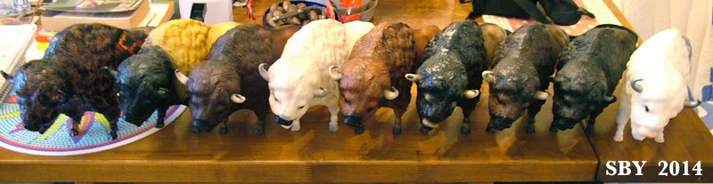
 Normally Breyer's Web Specials blow right past me, but when I saw Banff the Silver Buffalo I leapt like a hooked fish.  For some reason I was sure I would win him, and I did -- a tribute to the powers of deep belief, I suppose.  The above arrangement shows my Buffalo Conga at its best: each beast is displayed with maximum contrast to its neighbors.  On the extreme left are my three examples of the old #76, the buffalo I knew as I was growing up.  He ran for 26 years!!  On the extreme right are Breyer's most recent 3 buffaloes, in order of their release, left to right.

The three most recent are Choc the pink-nosed (BreyerFest 2002, 850 head made), Taima the tortoiseshell see-through (Connoisseur 2010, 350 head made), and Banff himself (2014, 300 head). Glaring in the middle is Tatanka the White, model #380, released 1992-1993, rare today.

 Before we leave this particular arrangement, I'd like to point out some details.  Until Choc in 2002 only the old 76ers had white horns.  (And the Tatanka whites, but no one had any trouble telling those apart!)  From 1965, when the mold was introduced, to 1991, all buffaloes were one model number and they all had white horns, with dark-shaded, usually to black, tips.  After 1991 came a long string of dark-horned ones, eleven years' worth.  And after Choc, well, the horns are not white...!  So that's one clue to distinguishing between buffaloes:  note whether their horns are white or not.

 This arrangement (above) of my conga is somewhat more haphazard and personal:  it's as I took them down off the shelves!  Taima is at left -- thank you Margaret so much, how will I ever repay you!!  Talk about a generous friend...  Second-left is the "American Bison," the yellow-gold version.  Until I researched for this blog I hadn't realized that this yellow-dun animal was released twice, once in 1994-1996 and again in 2000-2005.  Mine is from the first distribution.  Like Tatanka he is easy to identify; but if your buffaloes are side-by-side on a high shelf, the hindquarters are hidden and you have only dark heads to deal with.  Things get a bit tricky then.

It has been great fun cropping these shots.  The buffalo is a long lengthy mold, one of Breyer's largest and longest, and these pictures reflect that.  Forgive the poor focus...
Above are my three 76ers, with Shag the darkest and oldest at left.  The red-chestnut one, so distinct! is certainly a later, younger issue from those 26 years.  Like my red-chestnut Moose, I was so thrilled to pick this one up:  a variation to cheer the heart of the collector.

This is what my Conga usually looks like.  Only six can fit on that top shelf.  Collecting more than  6 was a leap into the unknown:  I felt they could not go downstairs with the horses, which were fighting their own shelf-space battle.  The buffaloes can only go in front of the books.  What a conflict: books versus buffaloes!!  And yet still I had to get Banff.  When I opened him, two ideas were very clear:  He was "Frozen" inspired... and "So that's why he's so cheap: They only had to paint half of him...!"  The differences from Tatanka (best seen in the second picture) include a pink nose instead of a black one, smaller eyes, and solid-silver horns with no black tips, instead of the by-now-standard shaded-grey with black tips.  Banff's hooves are pink instead of shaded-grey.

 What's really interesting, now that you can see them all together, is the rarity of glossy.  Only two of these 9 are glossy, Choc and Banff (and Banff has to be).  Taima could possibly be considered part of this trend, but I consider the tortoiseshell to be a color unto itself, part of a group of translucents that started with the original Tortuga Andalusian Connoisseur back in 2004.   And given how glossy Breyer's bare plastic is, it's even conceivable that Banff's front half isn't glossed (although I think it is).  Glossy buffaloes!  Who'd-a-thunk-it!  Well, conga collectors like to speculate about weird possibilities...

 There is one buffalo I haven't talked about: the dullest and most boring brown of all.  In the top picture he is at the center.  This is another "American Bison," model no. 388, issued 1997-1999.  About his only claim to fame is his hand-detailed bi-eyes, seen above on the right.  There is a dash of darkish-reddish to that eyeball -- compare it to the one on the left.  But let's pause:  of all of them, he is probably the most realistic Buffalo.

Speaking of eyes, here is a close up of Choc.  His eyes also have much detailing:  not only a black pupil against dark brown, but a nice eyewhite line.  Note the lighter shading of the face above his eye, something no other buffalo has.
Although my Buffalo Conga is not "all-encompassing complete" -- no Woodgrain, no second yellow dun, no rare 1970s Whitegray -- I am very pleased with it.  For somebody who specializes in Western braidwork and Spanish-inspired silver parade, there is an appropriate touch of the Old West here.  On my bookshelves and in my soul, the buffaloes still raise their distant thunders.